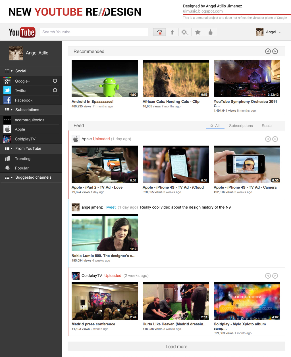
The elements on the sidebar are retractable to achieve minimal distraction when needed, adding social updates to Youtube its a great way to explore and find new content but can result in a very cluttered feed. Adding a toggle to the UI solves this problem.
Incorporated the most used functions to the header (Home, Upload, Browse, Favorites, Liked) plus the always omnipresent search bar.
Screenshot on Chrome:
Graphics: Adobe Photoshop.


No comments:
Post a Comment