
This is a project I started a couple of months ago, immediately after the current YouTube design was unveiled or leaked and now I have come back to work on it and improve it (I believe) and also incorporate new elements that my previous iteration didn’t have.
The project is heavily inspired by the Google+ design language, the goal was to make a much more beautiful YouTube that operates and feels like an app. Early on the first steps of the design I decided to not use the fixed three panels of the current UI as I think makes content looks crowded on screen.
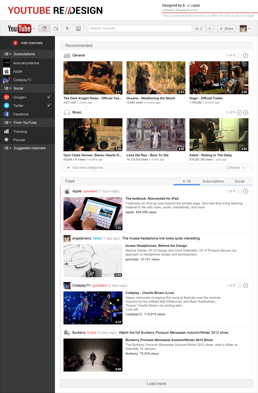
One of the new implementations of this design is the integration of the new Google bar along with the link on the logo to change between Google services, the first section of the design is “Recommended” I’ll admit that I don’t normally click on recommendations but I can’t deny their power as great exploration tools and that a lot of users really like them, came up with the idea to use categories that would feature the content the user is most interest in, there’s also a handy collapse function for those who like a more space saving look.
One of the new implementations of this design is the integration of the new Google bar along with the link on the logo to change between Google services, the first section of the design is “Recommended” I’ll admit that I don’t normally click on recommendations but I can’t deny their power as great exploration tools and that a lot of users really like them, came up with the idea to use categories that would feature the content the user is most interest in, there’s also a handy collapse function for those who like a more space saving look.
Next is the “Feed” with what I call the “actions system” or social integration, each and every entry on the feed will come branded with the action where it originated and a color that identifies his origin an elegant and non-distracting solution to integrate different social inputs into the feed, I also implement a hybrid version of the way uploaded entries are displayed on the feed, before the current YouTube layout there was the option to page through the latest uploaded videos right on the feed entry, on the current layout that behavior is eliminated in favor of a simpler approach similar to a timeline that offers more information about the videos, I always liked the option to page through different videos so I added the feature in combination to a similar layout of the current YouTube Feed design.
So there’s the first part of Project Apollo I have plan (sketch) one more section that’s why I’m denominating this a project, though I’m not entirely sure I will actually do it. If it happens this entry on the blog will be updated.
Thanks for reading,
A. J. Lopez


Absolutely gorgeous! Please spam E-mail Google... :)
ReplyDeleteGlad you liked the work, I don't think a spam attack would be the correct approach, have to admit that nothing would make me happier than seeing this concept move forward to development.
DeleteThere are still a lot of ideas I have for this design :)
OMG this is awesome! and the youtube preview excelent!
ReplyDeletegreat job! =D